Retailers needs a web presence that informs and inspires
I was quite chuffed, this morning, to have a short article on web usability published in The Journal. Much of what I wrote is, or at least should be, common sense: essentially, the need to understand what information your customers are looking for, and to give it to them in a way that is clear and engaging. Though the examples I used in the article related to tourism websites, the same principles apply across the board, including to retailers.
To be fair, many of those retailers with ecommerce sites have become increasingly adept at offering an easy and stress-free user experience. On the pure etail side, for example, Play.com’s clean, uncluttered interface makes it a pleasure to use – sometimes, it has to be said, more so than the increasingly complex Amazon.co.uk. Similarly, in more niche markets, many of the sites submitted to my Home Interiors Directory and Garden & Landscape Directory manage to combine a user-friendly online shop with a quirky and distinctive tone of voice.
Among those retailers that straddle both bricks and clicks, JohnLewis.com is particularly effective at conveying those brand values of space, quality and attention to detail that are similarly prominent within its stores. In contrast, I tend to find the Ikea website confusing to use, and normally end up heading to the physical store at MetroCentre instead.
Generally, though, I often find that it’s those retailers with simpler sites – providing basic information about the business, rather than e-commerce functionality – that would benefit most from an online revamp. So, using the example of department stores, how about some candidates for those retailers that I think are most or least effective at managing their basic online presence?
One retailer whose website has always disappointed me is Newcastle-based chain Fenwick. Though the site’s content has been beefed up of late, and now provides core information about the company and its stores, its imagery and overall appearance is somehow cold and aloof; certainly, there’s no sense of the retail theatre that you get when paying a visit to its Newcastle flagship.
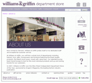
In contrast, the website for Williams & Griffin – a department store that Fenwick acquired in 2008 – conveys a much warmer and more engaging feel through its purple palette and use of colour photographs. Coverage of individual departments within the store is also more comprehensive than on its parent company’s site. Instead, Willie Gee’s main oversight is failing to tell us, anywhere on its home page or ‘about us’ section, where the store actually is. Thankfully, the ‘contact us’ page reveals that we can find Williams & Griffin in Colchester.
Over to another Fenwick acquisition – this time Bentalls, in Kingston-upon-Thames and Bracknell – and yet another different set of brand imagery. The layout and content of the site is functional, but the overall look is cheaper and less slick than you might expect for a quality department store brand. Generic smiling women stock photos, an unreadable scrolling ticker, and – worst of all – an @btconnect.com email address (should you fancy the advertised cookery classes) all convey a less than professional image. Equally, the ‘copyright 2006’ tag and lack of any news stories give the impression of a site that is not lovingly maintained.
If the Bentalls site conveys an image that seems at odds with its brand, Beales’ problem is that its site struggles to convey much of a personality at all. The home page is dominated – overwhelmed, even – by an enormous offers banner, yet the site gives only a limited feel for what it’s like to shop at a Beales store. Even the ‘about us’ page links to a ‘corporate statement’, its talk about ‘entry price points’, ‘trading policy’ and ‘assortments’ squarely aimed at shareholders rather than customers. Shoppers are unlikely to be wooed by the revelation that “value, at all levels of the market, plays an increasingly important part for our customers (sic) shopping basket”.
Encouragingly, we are promised a ‘new website’, ‘coming soon’ in autumn 2009; there’s even a countdown timer, helpfully informing us that the ‘time until launch’ is ’34 days, 2 hours, 10 minutes and 26 seconds’. That’s undoubtedly good news, but it’s always a risky ploy to make such a big deal of an upcoming website revamp – not only are you building customers’ expectations about what they can expect in 34 days’ time (which is fine, assuming that the new site meets or exceeds those expectations), but you’re also effectively saying to shoppers that “we realise our current site isn’t very good”.
One site that is too new to require a Beales-style makeover is that for the iconic Liverpool-based department store Lewis’s. The Lewis’s site is largely effective, speaking with a distinctly local voice that successfully conveys the retailer’s independence and uniqueness. The site also celebrates the store’s heritage – with historic photos, and visitors invited to ‘submit their memories’ – at the same time as providing plenty of information about current and planned developments. If you were to pick fault, you might argue that the site sometimes has too much going on – for example, it might benefit from a little more white space, and less content disappearing off ‘below the fold’.
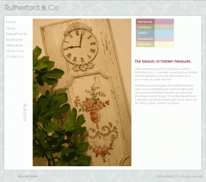
After so many niggles, we should probably end on a more positive note. One site that I particularly like is that for Rutherford & Co, an independent, family-owned department (or ‘lifestyle’) store based in Morpeth, in Northumberland. Where the Fenwick site fails to do the physical store justice, Rutherford & Co has packed its site with beautiful photographs that effectively convey the rich and quirky instore experience. “Welcome to the sumptuous world of Rutherfords”, the site’s home page declares, and – for once – it really does deliver on its promise.
Thank you to Zoran for making available the image used at the top of this post.







4 Responses
[…] likely location for GIVe’s North East debut. Alternatively, Rutherfords in Morpeth (mentioned here) or Robbs in Hexham would be obvious candidates, were GIVe to go down the concessions […]
[…] a post about web usability last year, I noted that while not all retailers will want or need an e-commerce site, there’s still […]
[…] is quite a simple affair, but it includes the core information that I flagged as crucial in my August 2009 blog about retailers’ websites: namely, the times that the shop is open; where to find it; and how to make contact. Good quality […]
[…] department store Rutherfords of Morpeth – which I’ve blogged about before – has a homepage that’s simple and clean with clear menus and not too much text. You […]