Newcastle’s revamped Wilkinson is better and brighter
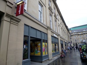
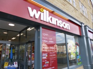
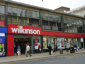
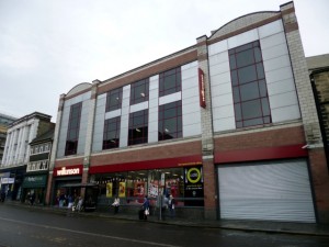
Since Wilkinson, the family-owned hardware and variety chain, quietly launched its new logo and store format over three years ago, the refreshed look seems to have been rolled out to much of the 370-strong estate. To the company’s credit, it hasn’t simply been a case of sticking a new logo over an unchanged store environment – all the stores that I’ve seen, like the one in Gateshead, have had a full internal makeover as well, while brand-new stores like the one in Alnwick have launched in the new format to start with.
As you would expect, some tweaks have been made along the way – most noticably in terms of the fascia, which has ended up a much deeper (and less garish) shade of red than at the trial store in Sheffield’s Haymarket. That particular property, incidentally, has a history of retail innovation, having previously housed a rare city-centre branch of Woolco, Woolworths’ ill-fated department-store format.
With most of the North East’s Wilkinson estate long converted over to the new format, the presence of an unmodernised store in the heart of Newcastle city centre has seemed a little incongruous. Occupying three large floors on the site of the old Farnons department store, the sheer size of Newcastle’s Wilko – as well as the constant crowds that shop there – should make it a flagship for the chain. More recently, however, it has felt rather tired and cluttered compared to the nearby revamped stores in places like Sunderland and South Shields.
Happily, however, Newcastle’s turn has now come, and the store has finally had a full makeover of its own.
Since the crisper new look was introduced elsewhere, Wilkinson’s old logo has started to look particularly clunky and dated. In Newcastle, the modern feel of the rebranding works especially well with the 1990s Newgate Street frontage, but is also – using individual white letters attached to the stone fascia – harmonious with the store’s Listed façade on the Nun Street side.
In both cases, the new look gives the store a much brighter and bolder face to the street. In Newgate Street, this has also been helped by opening up some of the ground-floor windows that had previously been covered up behind the tills. Looking at the before and after shots above, note too how the rather twee advertising for ‘The Galley Coffee Shop’ has been replaced by the much bolder text and graphic of the new ‘Cafe’ branding.
The real revelation of the new store, however, is the interior. The bold navigational signage and general decluttering echoes the changes carried out in other Wilkinson stores, but the big difference here is in how the previously enclosed feel has been addressed.
By opening up the first- and second-floor windows on both sides of the building, the revamp has brought natural light in and afforded views out over the surrounding cityscape. Until now, I hadn’t even realised that the Newgate Street side had windows on the upper floors – they were covered by shelving inside the store, while their dark-glass exterior appearance made it difficult to tell whether they were genuine windows or not.
Another big issue with the store’s old incarnation was the queues. While there were banks of tills at both the Newgate Street and Nun Street entrances, only the latter were routinely open. This typically meant a long walk through the store if you were buying items from the first or second floors, and often quite a long wait once you got there. My response was generally to use the smaller but less stressful Gateshead store instead.
Now, however, this problem has been addressed not only by having operational tills at both ends of the ground floor, but also by introducing customer service and pay points on the first and second levels. Previously, Wilkinson had grown the Newcastle’s store’s grocery and convenience offer – bringing in products such as bread, milk and sandwiches – without offering a store experience that made it easy and quick to just pop in and out. Opening more tills, in more locations within the store, should make it much less of an ordeal for customers to pay for their goods.
So, all in all, the new Newcastle Wilkinson seems like a big success on all fronts: a store that not only looks more appealing, but one that makes it easier and more pleasurable for customers to complete their shop. In a highly competitive environment, those are two fundamental principles that other retailers would do well to embrace.






What an interesting post – I didn’t even know work was being done to Wilko’s in the city centre!
I’d always assumed that The Galley Café was independently owned, given its awful dated branding. With it rebranding in line with the store brand, has it now been brought in house? Or was it always in house, and I’d just assumed wrongly?