Can Clintons’ new look help restore the chain’s fortunes?
Just two months after rescuing nearly 400 Clintons stores, the chain’s new owners have started rolling out a new look – inside and out – that they hope will lift the business’s fortunes.
Just days after the takeover, Retail Week revealed that Clintons’ familiar orange palette – a feature of its stores for as long as anyone can remember – was to be abandoned. As is typical of many large chains, several variations of the orange fascia exist across the Clintons estate.
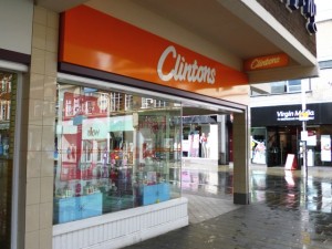
Stores opened or modernised in the last couple of years or so – such as St Helens, above – feature the most recent incarnation, with white handwritten-style ‘Clintons’ lettering on a deep orange fascia. This was itself an update of the branding that still appears on the majority of stores (below), which employs a very similar font but with the orange and white reversed. In these cases, the word ‘Clinton’ is prominent, with ‘Cards’ in a smaller sans-serif typeface underneath.
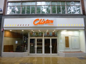
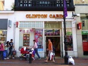
Finally, a third set of stores – such as Reading’s Broad Street, below – still feature an even earlier fascia, where both words within the name ‘Clinton Cards’ are given equal weight, spelt out in straightforward orange serif letters across the frontage.
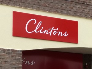
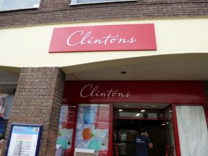
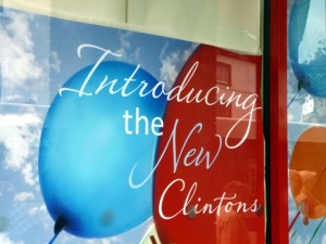
While jettisoning the orange in favour of a deep cherry red, American Greetings’ new look for the business retains a handwritten-style logo, but in a more elegant – and what you might call less ‘blobby’ – script.
Finally, just as each of the previous reincarnations described above has downplayed the ‘Cards’ part of the brand – presumably to reflect the growing gifts side of the business – so too does the new look: once again, it’s ‘Clintons’, not ‘Clinton Cards’.
The first of Clintons’ revamped stores was unveiled in London’s Cheapside a couple of weeks ago, with 100 more stores expected to be overhauled by the end of October. One of those is in the small Suffolk market town of Stowmarket, where work on the new shop in Ipswich Street was well underway when I visited last week.
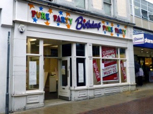
On the face of it, Stowmarket seems an unusual choice of location for one of the first revamped shops. The reason, however, is that it was among the 20 rescued stores that used to be a part of the Clintons-owned Birthdays chain. Hence, with Birthdays reduced to a rump following the closure of most of its stores – such as the one in nearby Ipswich, below – rebranding these shops to Clintons was always going to be a necessary first step.
Here in the North East, the ex-Birthdays store at Teesside Shopping Park in Stockton is another of those included in the rescue deal. Labelled as ‘coming soon’ on the Clintons store locator, it will be particularly interesting to see how the new-look Clintons works in an out-of-town setting.
So, can the rebrand help return Clintons to profitability? Certainly, even with the store not finished at the point when I visited, the new Stowmarket Clintons looked promising. The fascia is classy yet eyecatching, and has turned the premises into one of the best-looking shops on the street.
Meanwhile, though I’m yet to see a revamped store interior in the flesh, Retail Week’s photo gallery of the Cheapside store shows that it appears to tick the right boxes. The overall look is brighter, fresher and more engaging, while the replacement of the stores’ typically tatty carpets with a more modern and hardwearing wooden floor makes immense practical sense.
Together with the more upmarket fascia, these types of improvements certainly go some way towards restoring the missing ‘wow factor’ that I talked about in May, and begin to justify Clintons’ higher-end pricing. As I argued then, a key factor behind Clintons’ troubles was its confused positioning, with prices notably higher than its main rival, Card Factory, but with a typically dowdier and less inspiring instore environment.
Not everything seems quite there yet, however. While Retail Week’s photos show a spacious and attractive gift area at the front of the Cheapside store, my concern would be with the card aisle, which appears to combine quite tall mid-shop equipment with a rather narrow aisle. This is likely to get congested at busy times, and may need some attention in the future.
There are other unanswered questions, too. While I really like the new Clintons branding, I worry that there is a certain Americanness to the look and feel that might not gel with UK consumers. Also, of course, the business’s new owners will need to address in due course how Clintons can best tap into opportunities online, most notably the growing market for personalised cards. As yet, the company’s website remains largely unchanged from before the takeover, but will surely get its own makeover before long.
In my earlier blog following Clintons’ collapse, I ended with the thought that “if Clintons is to have a future, it needs to take on its rivals by doing things differently or better, see the Internet as an opportunity not a threat, and make sure it conjures up the instore wow factor that’s been sadly missing to date”.
It’s going to be a long haul, but I’m optimistic that Clintons’ new look is a big step in the right direction.
My retail consultancy business, CannyInsights.com, works with retailers nationwide to improve their stores, customer communications and market knowledge, and can provide bespoke place- and sector-specific market intelligence. For more information, visit www.cannyinsights.com, drop me an email, or give me a call on (0191) 461 0361.





I think almost any re-vamp has to be an improvement on the hideous 1980’s orange look. However the big question for me is whether they have improved the product range. The design of their cards seems to be stuck in the past. If you don’t want something with either the event blazoned on the front or a stomach churning pre-printed message inside then forget it. Personally I doubt they can find anywhere to trade between Card Factory at one end of the market and more upmarket chains such as Scribbler at the other. That’s not even factoring in the improvement in supermarket offerings and the shift towards electronic communications.
always love this site .. great insight to what’s the feel out on the Hight St… well done Graham !
as for the ‘new’ clintons , I agree , it does look very American and I agree with dan too , the logo looks awful .. as if someone said ‘ quick , we need a logo – write something down ‘ Is the brand too tainted with failure – a bit like Ethel Austin ? The current stores do look old and tired , but is this look right ? Is the focus on gifting right at the moment when disposable income might be tight ? I wish the compant and staff well but …..
The new font is absolutely hideous, it honestly looks like one of the free fonts they give you on Microsoft Word. It already looks about 10 years out of date.
A burnt orange (i.e. adapting rather than ditching their famous colour template) would have looked much more attractive that the red.
It all screams “granny”.