The return of “I haven’t seen one of those in a while…”
Back in September 2009, Soult’s Retail View readers seemed to enjoy my exposé of an old-style WHSmith logo at the rear of the branch in Redcar – well over a decade after that logo was supposedly retired.
In November last year, the early 1980s ‘Woolworth’ logo that I spotted in Burton upon Trent also attracted some interest. So, it seems there’s still quite a bit of mileage in hunting out the shop signs that time – and the retailers who own them – forgot!
This time, BHS is the focus of attention – a company that has had a fairly bewildering range of name and logo tweaks over the last quarter of a century. Just as Marks & Spencer was widely referred to as M&S long before it started using that brand itself, the business previously known as British Home Stores only began labelling itself ‘BhS’ (with the ‘h’ in lowercase) in 1986.
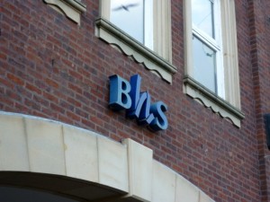
Although the ‘ribbon’ logo introduced at that time was replaced in 1995, Carlisle’s store – which I recently photographed, above – is one of a few unmodernised stores to still use it on its frontage.
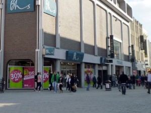
The Newcastle store, which is about to close down, features the more recent ‘signature’ logo on a greeny blue background, and with the business name now written as ‘Bhs’ (only the ‘B’ capitalised).
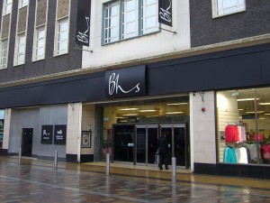
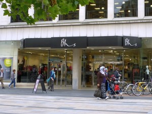
This fascia was was used from 1995 until the mid-2000s, when new and refitted stores – such as those in Middlesbrough and Leicester – started to feature the signature logo on a new black background, coinciding with the introduction of other Arcadia brands instore.
Since last year, however, the signature logo has been superseded by a new visual identity – still featuring white text on a dark background, but with the business restyled as ‘BHS’, all in uppercase lettering. This new look is yet to be introduced to many stores, but has already been rolled out across the retailer’s website, POS displays, instore signage and carrier bags.
The new logo is certainly bold and modern, and seems like a deliberate break from the past – signalling that the brand-new BHS stores have quite a different feel from their predecessors. I do wonder, however, if it’s lost some of the personality of the old BHS logo, given that so many other retailers – Barratts or Warehouse, for example – use a very similar, understated uppercase typeface.
Still, it won’t be too long until we get to see the new logo and store design in the flesh at BHS’s relocated Newcastle store. On current form, Carlisle, meanwhile, may have to wait until the next logo revamp in 2025…




BHS in Surrey Quays, SE16, still has the pre ’95 logo both inside the shopping centre and outside. As the store is set to close tomorrow, it ain’t gonna change!
Incidentally, maybe it’s time to do a similar project for former BHS stores, as you did for Woolworth’s? The Surrey Quays BHS is set to become ‘ The Range’
looks like a GAP logo
Bhs still has an old logo like the one in Carlisle in its Aberdeen store.
Thanks Stu! I don’t know if you saw the post, but I recently spotted the same logo on the Exeter store too: http://www.soultsretailview.co.uk/2011/09/15/swindons-bhs-provides-a-taster-of-what-newcastle-and-hartlepool-can-expect/