
Good logo, bad logo – Gateshead’s revamped Wilkinson and Argos stores
. Photograph by Graham Soult")
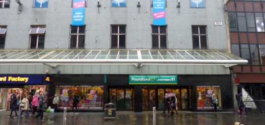
Wilkinson, Gateshead (14 Feb 2011)
Given that a significant chunk of Gateshead town centre is currently flattened and awaiting redevelopment, it’s pleasing to see one of the town’s biggest retailers investing in its store.
Along with Tesco, the long-established Wilkinson store in the Interchange Centre is probably the town centre’s biggest draw. It’s not as big as the massive stores in Newcastle or South Shields, but it’s a decent size and always busy, stocking many product ranges that aren’t readily available elsewhere in the town.
West Street frontage, Wilkinson, Gateshead (15 Feb 2011)
Popping in last week, I was pleased to see that the interior of the store is getting a spruce up, and that the old, rather tired Wilkinson signs have been replaced by ones bearing the new, cleaner logo – previously blogged about in July 2009. As I argued then, I find the new, crisp logo a massive improvement on its rather old-fashioned and clunky predecessor.
Inside the store, the ongoing revamp seems very similar to the rebranded and modernised stores that I’ve already seen in Leeds and Sunderland, with improved signage, better views through the store, and a generally cleaner and less cluttered feel.
Outside – both in West Street, and within the transport interchange – the Wilkinson building is hardly a looker with its crinkly brown and red façade. However, the new signage makes a surprisingly big difference in giving it a fresher appearance, even if the West Street sign does seem a rather odd shape – presumably to cover up the holes left by the old one.
. Photograph by Graham Soult")
....and how it looked before (17 Sep 2009)
In contrast, the building on the opposite side of West Street has a new logo that I’m finding it much harder to warm to. This is the Argos store, occupying part of what used to be the North East Co-op department store in New Century House.
Argos, Gateshead, with new logo (14 Feb 2011)
...and how it looked before (16 Dec 2009)
In common with the rebranding taking place across the rest of the 700-plus-strong Argos estate, the store has recently gained new signage, featuring the chain’s revamped logo.
When the modernised logo was launched just over a year ago, Argos’s Head of Brand Marketing was quoted by Retail Week, making reference to the “strong customer recognition” of the Argos ‘smile’ and arguing that the new version “remains instantly recognisable” but “feels more modern and relevant.”
New Argos logo, Nuneaton (24 Aug 2010)
Old Argos logo, Sunderland (7 Sep 2009)
I’m not convinced – to me, the new logo just looks like a cheapened version of the old, while at the same time hanging together less successfully as a piece of design.
To be honest, I’d never realised that the swirl was supposed to be a smile, but it worked well as a device in linking together the ‘A’ and the ‘s’, and giving the logo a coherent look. In the new version, in contrast, the ‘smile’ floats oddly under the text, while the formerly distinctive font has been replaced by something much more bland and generic.
Even as signage, the modernised font seems to work less well. While the old version usually had the red text superimposed on a blue background, the new one commonly ends up with a red rectangle seemingly stuck slightly randomly on top of a blue backdrop. An improvement? Again, not in my book.
Perhaps the chain’s shoppers will agree that the new look is “more modern and relevant” – but it certainly doesn’t put an Argos smile on my face.


The new wilko logo and rebrand actually doesnt put up any costs for the customer as wilko is a family business and is investing in the rebrand for the future and the family is willing to take the cost rather than the customer to secure the long term investment of the business.
The old Wilkinson’s symbol is fine. The change in branding just means higher costs for customers. Pointlessly replacing “old” signs is a nonsense; better to update it when the old one is worn.
Fair point! Do you reckon most ordinary customers even notice such things, or is it just retail geeks like me who actually care? :)
The new Wilkinson logo is a welcome improvement on their dated older one, whilst I don’t dislike the new Argos logo I find it bland and lacking the uniqueness of the older one.
One trend I’ve noticed lately is the fact that logos are refreshed more and more frequently, it almost seems that we get used to a new branding and then an updated design is introduced.
Examples that spring to mind are Argos and Comet. Both stores had long standing logos from the 70’s era which were updated about ten years ago, and have since been ‘tweaked’ again. Currys too seems to have had a couple of logo refreshes in quick sucession.
I suppose ten years is a long time in the fast paced world of retail and of course it keeps the design consultants and sign makers in business.
I didn’t think I liked the new Wilko’s logo when I saw it at the top of your post, but when I then scrolled down to see the old one and then looked again – you’re right; it looks a million times better. I also agree about the Argos logo. The Corner House in Heaton has changed signage recently and the new sign looks cheap and odd in comparison to the old one (and ironically I didn’t like the old one in the first place!).
I hadn’t realised the Argos logo was supposed to be a smile either. Who did, I wonder?