
Wilkinson’s trial rebranding here to stay?
 and old (bottom) Wilkinson logos")
New (top) and old (bottom) Wilkinson logos
Over the last few months, you may have spotted the new Wilkinson logo – above – that has been quietly appearing on the retailer’s bags and own-brand product packaging.
I’m yet to read anything suggesting that the new logo is any more than a trial, linked to the testing of a new store format; certainly, the full rebrand seems to have been rolled out to only a handful of stores so far (but with seemingly positive reviews), and the WilkinsonPlus website is yet to receive any makeover at all. However, the new logo’s increasing ubiquity on Wilkinson bags and products suggests that it may well be here to stay.
I’ve never been a great fan of the old logo, which has been around for as long as I can remember (i.e. the 1980s!), and has been looking rather tired and clunky for, well, as long as I can remember. The new logo, in contrast, seems to be informed by similar principles to those that have made the 2007 rebranding of Morrisons a success.
First, it is much cleaner and crisper as a visual identity – particularly when viewed online. Second, just like Morrisons, the new logo respects the heritage of the old by retaining the same dominant colour (in this case red), but opting for a less garish shade. Again echoing Morrisons, this is presumably designed to assist Wilkinson in making further inroads beyond its north of England heartland, gently shifting perceptions from that of a value retailer to one that also emphasises quality.
Given that Wilkinson now has 325 stores across the UK, it will certainly be quite an undertaking to roll out the new look to all of them – particularly if, as with the trial stores, it involves a full revamp of the store interiors rather than just a new logo on the outside.

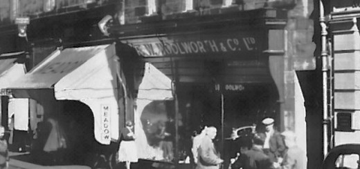
Old Wilkinson logo at the Newcastle upon Tyne store

Old logo at Gateshead store
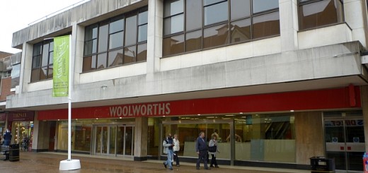
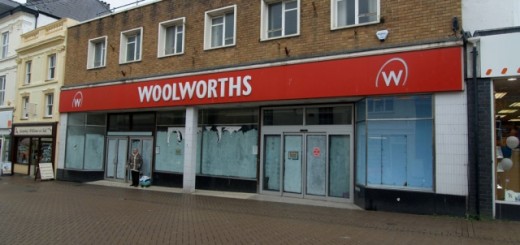
I’m also not clear whether Wilkinson’s new stores – such as the one due to open in Barnstaple in September – are already adopting the new store format and visual identity. Barnstaple’s new store, incidentally, is noteworthy in that it’s one of the very few former Woolworths sites that Wilkinson has acquired; the only others that I’m aware of are in Ilford and Bognor Regis.
I’m surprised really that Wilkinson has not snapped up more of the larger Woolworths stores, given that it sells many of the same products (only more successfully), and in many ways can be seen as Woolworths’ natural successor. Perhaps it’s because Wilkinson is already represented in many of those town and city centre locations – such as Newcastle – where the old Woolworths stores are large enough to meet its needs?
Anyway, now it’s over to you with a couple of questions. First, what do you think of the new logo? And second, where else would you like to see Wilkinson take over an old Woolworths store?


Whilst a regular shopper at wilkinsons Colchester ave the staff are very polite and friendly I know if I’m having a bad day that they will cheer me up the main staff that I get to have a chat with are the till staff on the late shift whilst some are not so cheerful the till staff are . On this occasion I went into store the manger of the store was speaking to said till staff like they were naughty children I didn’t much appreciate this and was disgusted whilst in store .if it wasn’t for great customer service I receive from the tills I would take my custom elsewhere due to poor managerial skills it needs to be sorted or you will loose a lot of your customers
Having read your article, I find that through my own observations and shopping experience in the north of England from childhood to teenage years and on to adulthood……
Woolworths was a cheap and cheerful experience.
My grandmother first took me to “Woolies” as a small child and it was an eclectic mix of confectionary and cleaning products. The sweeties,”pick n mix”, was a firm favourite down to the cheap stationary and toiletries. The bold red signage with large font, represented an iconic shopping experience.
However, during my teenage years it took a different perspective and I found myself discovering a multitude of teenage cosmetics which were pocket money friendly, but not well received by my mother, who advised a trip to John Lewis and a tour of the Chanel counter where her mother had introduced her to the concept of lipstick for the more sophisticated woman, a family tradition.
In later years after living abroad for a while and not a Woolworths in sight…..I rediscovered Woolworths….sadly it had seemed to have lost some of its lustre…..and was in need of an makeover….only to find it later to disappear without trace…..memories left of happier nostalgic times.
Now we have Wilkinsons….my local branch was quite shabby and again cheap and cheerful….however, recently there have been changes and after the rebuild of town centre the new and improved Wilkinson’s is quite bright with much improved layout and although not a store I visit regularly, seems quite improved since my last visit.
Unfortunately, the same cannot be said of the level of staff and customer experience. As I have experienced quite a lack of customer engagement, I feel that most of the staff would prefer not to be employed in their current roles as their ability to communicate and resolve any issues seems non existent.
I feel they would benefit from further training regarding how to treat customers and realise their roles and responsibilities towards customers without whom they would be unemployed.
I fear in these times of cutbacks and unemployment that some of the employed feel that they can give attitude to customers which is not mindful of their position.
Therefore, regrettably, I feel I will be taking my custom elsewhere, rather paying a few pence more than receiving a bad customer experience.
Logos are expensive….good manners and polite customer care cost nothing…..surely, that should come as standard?
The new wilkos is still about value products but a much friendly shopping environment
Just for your info. Wilkinson’s new corporate image is being rolled out on a national basis. All new Wilkinson stores set to open will be in the new theme, with a further 80 of their existing stores being rebranded this year. The remaining sites in their property portfolio will be converted over the next 4 years. So it’s goodbye to the old Wilko’s and hello to the new, better Wilkinsons!! I follow their progress closely as I used to work for them and still hold them close to my heart…..sad I know but true!!